Which genes are most differentially expressed between specific cell clusters, and how do these genes inform the functional differences between these cell types?
What biological pathways are enriched in differentially expressed genes, and how might these pathways be relevant to disease mechanisms?
How do specific clusters (e.g., vascular smooth muscle cells) differ in their expression of key marker genes compared to other clusters?
2 Intended Audiences
The intended audience for this analysis includes academic researchers and clinicians focusing on vascular biology and human cardiovascular health. This analysis is particularly relevant for those studying cellular heterogeneity and gene expression patterns in normal human aorta tissue, providing a baseline for comparison with diseased states such as atherosclerosis. Additionally, bioinformaticians and data scientists interested in single-cell RNA-seq methodologies can benefit from the data wrangling and visualization techniques applied here. Finally, biotech and pharmaceutical industry professionals may find value in understanding baseline gene expression profiles to guide early-stage research in cardiovascular therapeutics and biomarker discovery.
3 Original data
GSE216860 is a publicly available dataset from the Gene Expression Omnibus (GEO) that provides single-cell RNA sequencing (scRNA-seq) data of normal human ascending aortic tissues from donors of varying ages.
“The study aimed to investigate age-dependent changes in cellular composition, phenotypes, and cell-cell communication within the aorta. The dataset includes samples from six organ donors, categorized into a young group (ages 3 months, 1 year, 3 years, and 12 years) and an old group (ages 57 and 58 years). Analysis of 65,470 cells identified ten cell types, including endothelial cells, smooth muscle cells, fibroblasts, mesenchymal cells, macrophages, and various immune cells.”
Here we work with the pre-processed DEG dataset after data QC, normalization, dimension reduction and DEG analysis (FindAllMarkers) using Seurat pipeline(Satija et al. 2015). Given the original Seurat object is very large to load, we are directly loading the DEG marker genes .csv file.
4 Data Dictionary
Column
Description
gene
Gene name
avg_log2FC
Average log2 fold change between clusters
pct.1
Percentage of cells expressing the gene in Cluster 1/percentage of cells expressing the gene in the testing cluster (markers)
pct.2
Percentage of cells expressing the gene in Cluster 7/percentage of cells expressing the gene in all the other clusters (markers)
p_val_adj
Adjusted p-value for differential expression
cell_type
Type of cell where the gene is expressed
p_val
P-value for differential expression
cluster
Cluster in which the gene is analyzed
5 Data loading
Code
# Loading packageslibrary(dplyr)
Attaching package: 'dplyr'
The following objects are masked from 'package:stats':

    filter, lag
The following objects are masked from 'package:base':

    intersect, setdiff, setequal, union
── Conflicts ────────────────────────────────────────── tidyverse_conflicts() ──
✖ dplyr::filter() masks stats::filter()
✖ dplyr::lag()    masks stats::lag()
ℹ Use the conflicted package (<http://conflicted.r-lib.org/>) to force all conflicts to become errors
clusterProfiler v4.12.6 Learn more at https://yulab-smu.top/contribution-knowledge-mining/

Please cite:

Guangchuang Yu, Li-Gen Wang, Yanyan Han and Qing-Yu He.
clusterProfiler: an R package for comparing biological themes among
gene clusters. OMICS: A Journal of Integrative Biology. 2012,
16(5):284-287

Attaching package: 'clusterProfiler'

The following object is masked from 'package:purrr':

    simplify

The following object is masked from 'package:stats':

    filter
Code
library(org.Hs.eg.db)
Loading required package: AnnotationDbi
Loading required package: stats4
Loading required package: BiocGenerics

Attaching package: 'BiocGenerics'

The following objects are masked from 'package:lubridate':

    intersect, setdiff, union

The following objects are masked from 'package:dplyr':

    combine, intersect, setdiff, union

The following objects are masked from 'package:stats':

    IQR, mad, sd, var, xtabs

The following objects are masked from 'package:base':

    anyDuplicated, aperm, append, as.data.frame, basename, cbind,
    colnames, dirname, do.call, duplicated, eval, evalq, Filter, Find,
    get, grep, grepl, intersect, is.unsorted, lapply, Map, mapply,
    match, mget, order, paste, pmax, pmax.int, pmin, pmin.int,
    Position, rank, rbind, Reduce, rownames, sapply, setdiff, table,
    tapply, union, unique, unsplit, which.max, which.min

Loading required package: Biobase
Welcome to Bioconductor

    Vignettes contain introductory material; view with
    'browseVignettes()'. To cite Bioconductor, see
    'citation("Biobase")', and for packages 'citation("pkgname")'.

Loading required package: IRanges
Loading required package: S4Vectors

Attaching package: 'S4Vectors'

The following object is masked from 'package:clusterProfiler':

    rename

The following objects are masked from 'package:lubridate':

    second, second<-

The following object is masked from 'package:tidyr':

    expand

The following objects are masked from 'package:dplyr':

    first, rename

The following object is masked from 'package:utils':

    findMatches

The following objects are masked from 'package:base':

    expand.grid, I, unname


Attaching package: 'IRanges'

The following object is masked from 'package:clusterProfiler':

    slice

The following object is masked from 'package:lubridate':

    %within%

The following object is masked from 'package:purrr':

    reduce

The following objects are masked from 'package:dplyr':

    collapse, desc, slice


Attaching package: 'AnnotationDbi'

The following object is masked from 'package:clusterProfiler':

    select

The following object is masked from 'package:dplyr':

    select
Code
library(enrichplot)library(DOSE)
DOSE v3.30.5  For help: https://yulab-smu.top/biomedical-knowledge-mining-book/

If you use DOSE in published research, please cite:
Guangchuang Yu, Li-Gen Wang, Guang-Rong Yan, Qing-Yu He. DOSE: an R/Bioconductor package for Disease Ontology Semantic and Enrichment analysis. Bioinformatics 2015, 31(4):608-609
We have another marker genes and cell type mapping dictionary, we will load this data for mapping cluster identity. This is an empirical mapping of markers genes of major aortic cell types. However this .csv is based on mouse gene, we will need to convert all lowercase letter in gene names into uppercase, and change one gene H2-aa to HLA-DRA to completely change the list of mouse markers into human markers.
Code
# Loading cell type marker genes dictionaryMapper <-read.csv('/Users/roujinan/Desktop/StatsComp_project1/DataAnalysis/atherosclerotic_plaque_marker_genes.csv')head(Mapper)
# Use mutate to replace 'H2-aa' with 'HLA-DRA' in the 'gene' columnMapper<- Mapper %>%mutate(gene =ifelse(gene =="H2-aa", "HLA-DRA", gene))# Convert 'gene' column to uppercase, 1st usage of dplyr function mutateMapper <- Mapper %>%mutate(gene =toupper(gene))print(Mapper)
Data preparation is done. Next we want to select the genes that are present in both dataset, and to map the identity of each cluster.
Code
# Innerjoin two dataset and arrange the joint output. The use of 3 more dolyr and tidyr function: inner_join, select and arrange.IJ <-inner_join(markers, Mapper,by='gene')ClusterIdentity<- IJ %>% dplyr::select(c('gene','cell_type','p_val_adj','cluster')) %>%arrange(cluster)ClusterIdentity
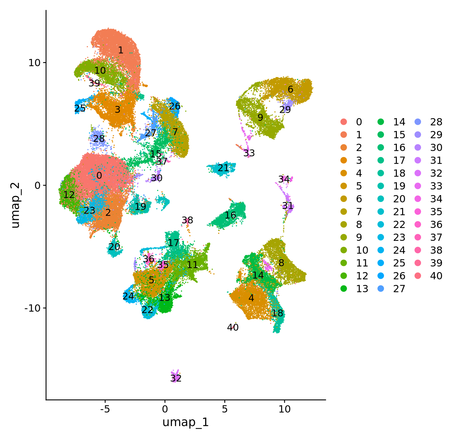
Based on the chart, it will be easy to map the cluster identity with the markers. Combining with the original markers data, question 1 can be answered. Since with this results, it was apparent that some clusters, for example cluster 18 contains multiple immune cell type markers such as Macrophages, Dendritic cells, Foam cells and T cells, it may be wise to conduct further subclustering to the original data. We didn’t load the data here, thus we don’t assert cluster identity for these “mixed clusters”.
However, cluster 0 shows clear Fibroblast markers and cluster1 shows clear vascular smooth muscle cells markers expression. At the same time, cluster 7 also seems to be a smooth muscle cell cluster, yet it was quite separated from cluster 1 on the UMAP. Thus we will continue here with these three clusters.
Next, we want to know the differentially expressed genes between the two smooth muscle cell cluster 1 and 7. We ran DEG between the two clusters in seurat on the original data, which is not shown here. The data output is VSMCmarkers.csv, which will be loaded here for further analysis.
# Filter significant markers with adjusted p-value < 0.05, the application of the 5th dplyr and tidyr function: filtersignificant_VSMCmarkers <- VSMCmarkers %>% dplyr::filter(p_val_adj <0.05)dim(VSMCmarkers)
[1] 12591 6
Code
dim(significant_VSMCmarkers)
[1] 6335 6
Note
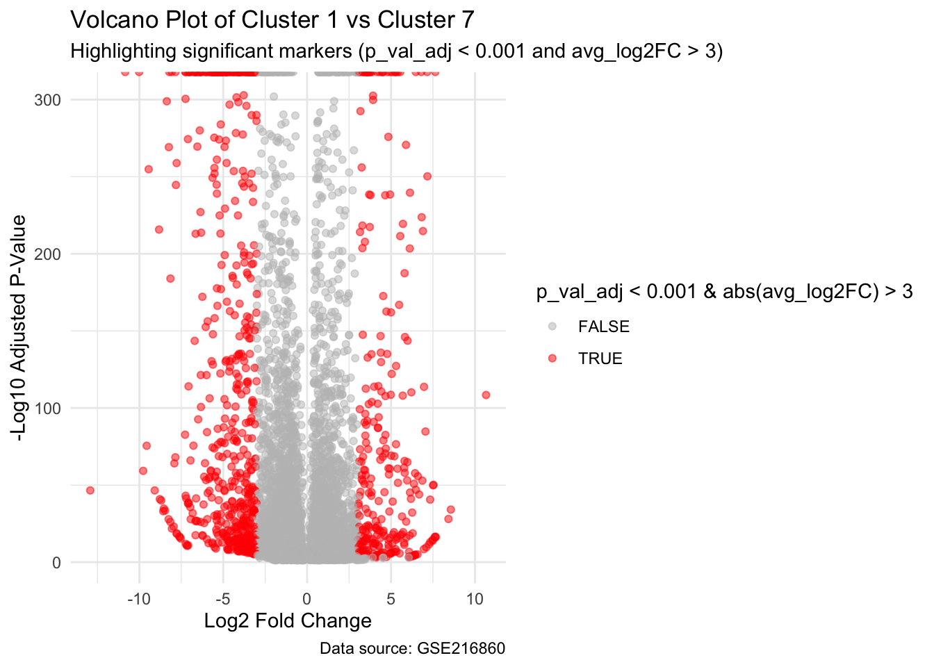
Note: The analysis identified key differentially expressed genes between Cluster 1 and Cluster 7. Both clusters are VSMC clusters. We are interested in exploring the difference between these two clusteres, which is very likely to me batch/sample difference due to different sample age.
6 Visualization of DEG between VSMC clusters with volcano plots
Plots below were created using ggplot2, a powerful data visualization package(Wickham 2016).
Code
# Replace zero p-values with a very small number to avoid issues in the plotsignificant_VSMCmarkers <- significant_VSMCmarkers %>%mutate(p_val_adj =ifelse(p_val_adj ==0, 1e-350, p_val_adj))# Volcano plotggplot(significant_VSMCmarkers, aes(x = avg_log2FC, y =-log10(p_val_adj))) +geom_point(aes(color = p_val_adj <0.001&abs(avg_log2FC) >3), alpha =0.5) +labs(title ="Volcano Plot of Cluster 1 vs Cluster 7",subtitle ="Highlighting significant markers (p_val_adj < 0.001 and avg_log2FC > 3)",x ="Log2 Fold Change",y ="-Log10 Adjusted P-Value",caption ="Data source: GSE216860" ) +theme_minimal() +scale_color_manual(values =c("grey", "red"))
Code
# Grey for non-significant, red for significant
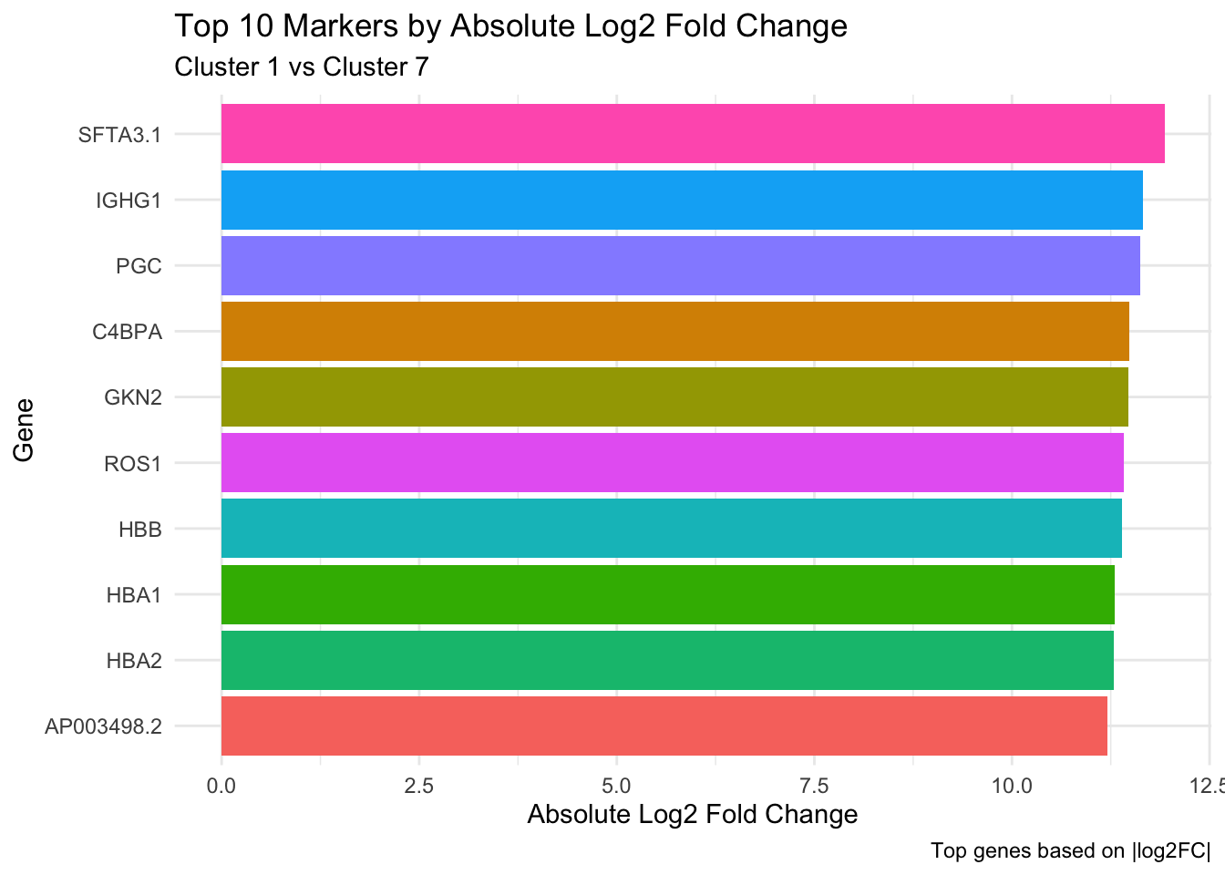
7 Barplot
Code
# Select top 10 markers by absolute log fold changetop_markers <- markers %>%arrange(desc(abs(avg_log2FC))) %>%head(10)# Bar plotggplot(top_markers, aes(x =reorder(gene, abs(avg_log2FC)), y =abs(avg_log2FC), fill = gene)) +geom_col(show.legend =FALSE) +labs(title ="Top 10 Markers by Absolute Log2 Fold Change",subtitle ="Cluster 1 vs Cluster 7",x ="Gene",y ="Absolute Log2 Fold Change",caption ="Top genes based on |log2FC|" ) +coord_flip() +theme_minimal()
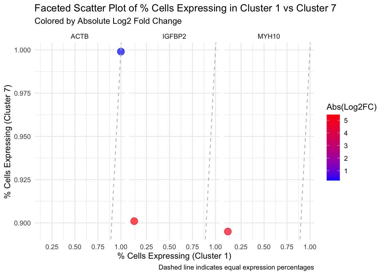
8 Dotplots demonstrating DEG expression between clusters
This plot will visualize the relationship between pct.1 and pct.2 for multiple genes, faceted by each gene.
Code
# Select a few significant genes for visualizationselected_genes <- significant_VSMCmarkers %>%filter(gene %in%c("ACTB",'MYH10', 'IGFBP2')) # Example gene names# Faceted scatter plotggplot(selected_genes, aes(x = pct.1, y = pct.2)) +geom_point(aes(color =abs(avg_log2FC)), size =4, alpha =0.7) +# Color points by log2FCgeom_abline(slope =1, intercept =0, linetype ="dashed", color ="grey") +# Equality linefacet_wrap(~ gene) +# Facet by genelabs(title ="Faceted Scatter Plot of % Cells Expressing in Cluster 1 vs Cluster 7",subtitle ="Colored by Absolute Log2 Fold Change",x ="% Cells Expressing (Cluster 1)",y ="% Cells Expressing (Cluster 7)",color ="Abs(Log2FC)",caption ="Dashed line indicates equal expression percentages" ) +scale_color_gradient(low ="blue", high ="red") +# Color gradienttheme_minimal()
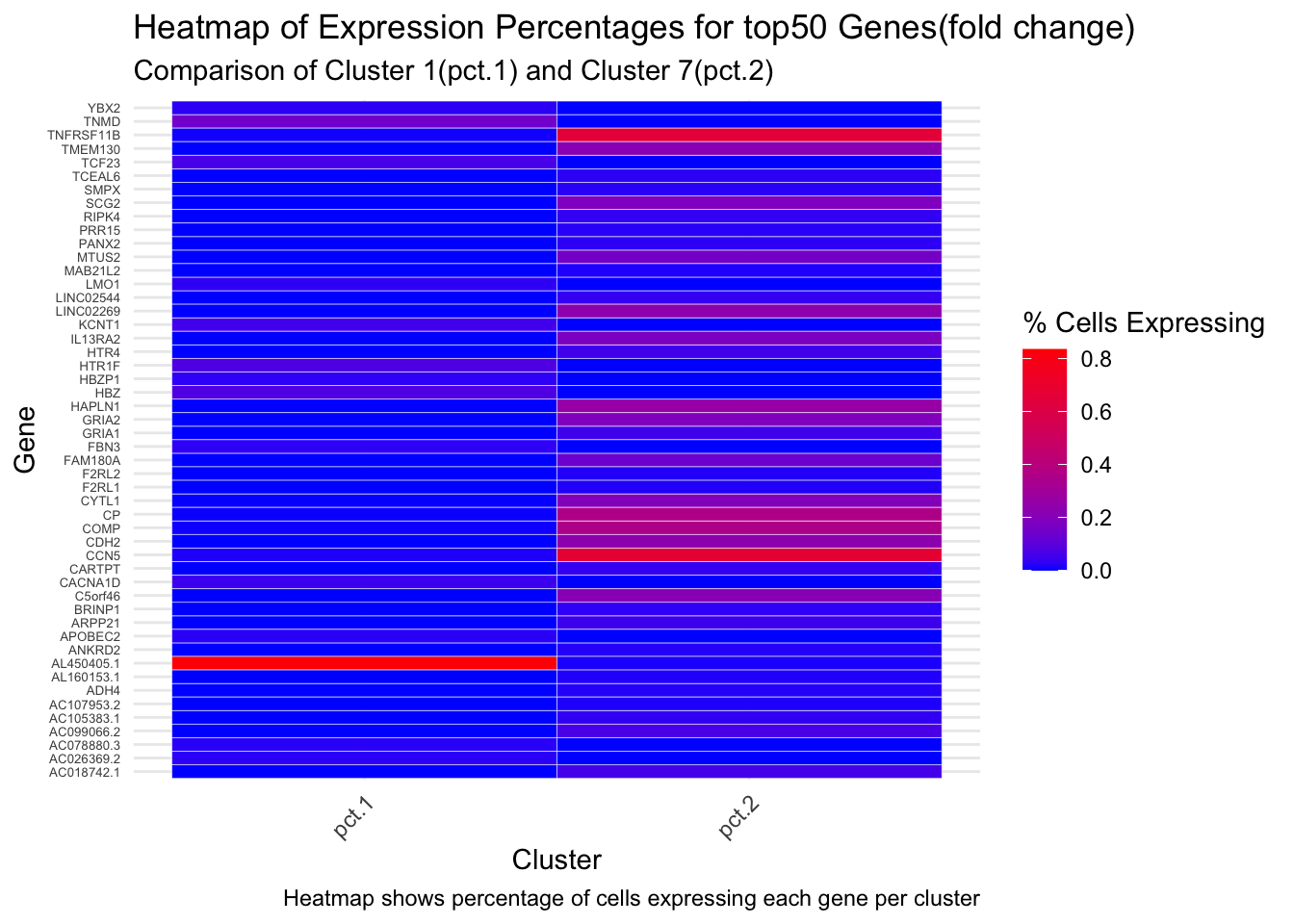
9 Heatmap (geom_tile()) for Expression percentage of genes with top50 fold_change
Code
# Reshape data for heatmapall_genes_long <- significant_VSMCmarkers %>%arrange(desc(abs(avg_log2FC))) %>%head(50) %>%pivot_longer(cols =c(pct.1, pct.2), names_to ="cluster", values_to ="expression_pct")# Heatmap for all genesggplot(all_genes_long, aes(x = cluster, y = gene, fill = expression_pct)) +geom_tile(color ="white") +# Heatmap tilesscale_fill_gradient(low ="blue", high ="red") +# Gradient color scalelabs(title ="Heatmap of Expression Percentages for top50 Genes(fold change)",subtitle ="Comparison of Cluster 1(pct.1) and Cluster 7(pct.2)",x ="Cluster",y ="Gene",fill ="% Cells Expressing",caption ='Heatmap shows percentage of cells expressing each gene per cluster' ) +theme_minimal() +theme(axis.text.y =element_text(size =5), # Adjust for many genesaxis.text.x =element_text(angle =45, hjust =1) )
Warning
Warning: The percentages shown here for pct.1 and pct.2 are based on seurat FindMarkers function, pct.1 and pct.2 are separately set in the function argument. Do not assume the identities of two clusters here. The pct.1 and pct.2 from the markers data was generated with FindAllMarkers function in seurat, where pct.1 is the cluster of interests, pct.2 is all the other clusters.
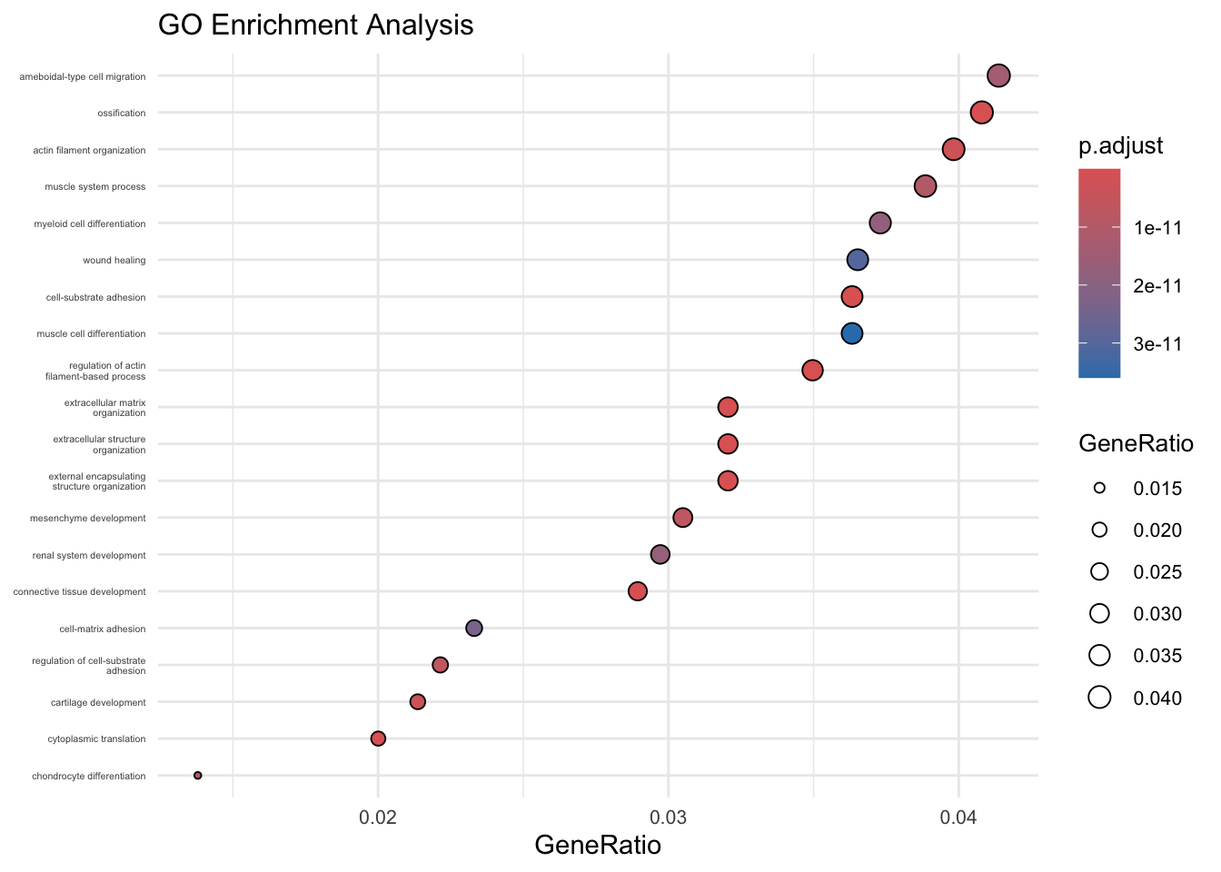
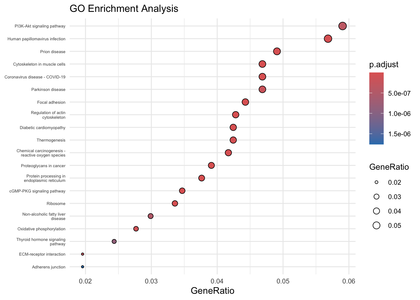
dotplot(kegg_enrichment, showCategory =20, size ="GeneRatio") +# You can use another numeric value column like "Count"ggtitle("GO Enrichment Analysis") +scale_size(range =c(1, 4)) +# Adjusts the minimum and maximum dot sizestheme_minimal() +theme(plot.title =element_text(size =12),axis.text.x =element_text(size =8),axis.text.y =element_text(size =5),legend.text =element_text(size =8),legend.title =element_text(size =10) )
Scale for size is already present.
Adding another scale for size, which will replace the existing scale.
Code
# Convert gene symbols to Entrez IDsentrez_ids2 <-bitr( significant_VSMCmarkers$gene,fromType ="SYMBOL", # Input type (gene symbols)toType ="ENTREZID", # Output type (Entrez IDs)OrgDb = org.Hs.eg.db # Database for human genes)
'select()' returned 1:1 mapping between keys and columns
Warning in bitr(significant_VSMCmarkers$gene, fromType = "SYMBOL", toType =
"ENTREZID", : 7.75% of input gene IDs are fail to map...
Code
# Merge Entrez IDs back into your original datadeg_data <-merge(significant_VSMCmarkers, entrez_ids, by.x ="gene", by.y ="SYMBOL")# View the data with Entrez IDsranked_genes <- deg_data %>%arrange(desc(avg_log2FC)) %>%pull(avg_log2FC) # Pull log2FoldChange values as vector# Assign Entrez IDs as namesnames(ranked_genes) <- deg_data %>%arrange(desc(avg_log2FC)) %>%pull(ENTREZID) # Pull corresponding Entrez IDs# Verify structurehead(ranked_genes)
using 'fgsea' for GSEA analysis, please cite Korotkevich et al (2019).
preparing geneSet collections...
GSEA analysis...
leading edge analysis...
done...
Code
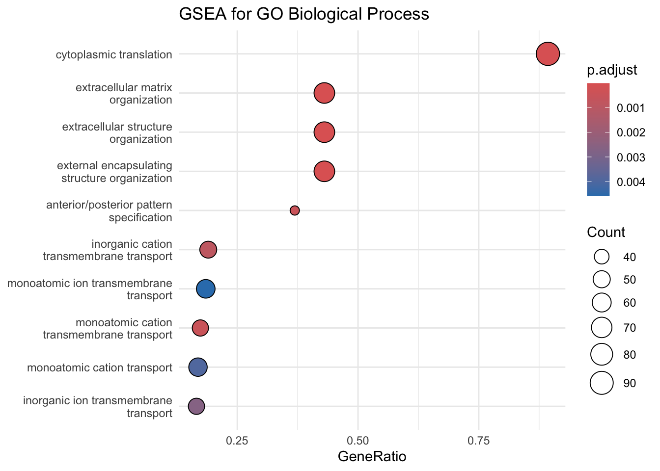
# Dotplot for GOdotplot(gsea_go, showCategory =10) +ggtitle("GSEA for GO Biological Process") +theme_minimal()
Code
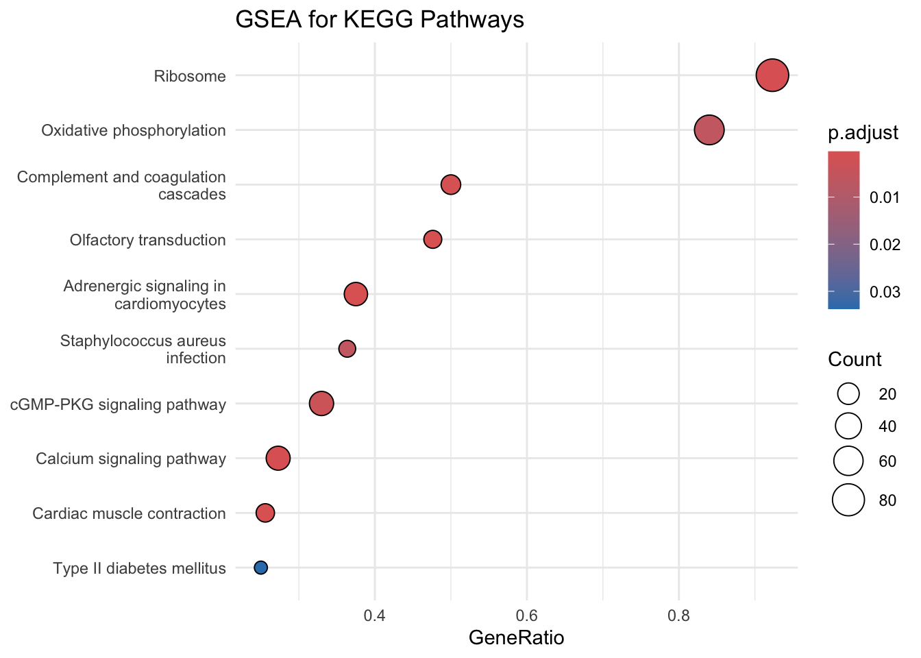
# Dotplot for KEGGdotplot(gsea_kegg, showCategory =10) +ggtitle("GSEA for KEGG Pathways") +theme_minimal()
Key Insight: Single-cell RNA sequencing enables detailed exploration of cellular heterogeneity within complex tissues like the aorta. This analysis is based on Seurat output and ggplot2 to identify and visualize distinct marker genes and defferentially expressed genes across clusters.
11 Summary
This analysis explored the cellular heterogeneity of human aortic tissues using single-cell RNA sequencing data from GSE216860. Differential expression analysis among all UMAP clusters identified cell type identity of each cluster, and DEG analysis between two vascular smooth muscle cell clusters Cluster 1 and Cluster 7 identified key marker genes associated with extracellular matrix and actin filament organization, and cytoskeleton function. Visualization techniques such as volcano plots, bar plots, and heatmaps highlighted significant trends and provided insights into the relative expression and ratio across clusters. These findings demonstrate the utility of computational methods in uncovering potential targets for understanding vascular diseases like atherosclerosis. This study emphasizes the power of integrating data science with biological research to gain actionable insights.
12 Functions Used
Function
Purpose
Package
mutate()
Adds new columns or modifies existing ones.
dplyr
filter()
Filters rows based on specific conditions.
dplyr
arrange()
Arranges rows in ascending or descending order based on column(s).
dplyr
inner_join()
Joins two datasets based on matching keys in both tables.
dplyr
select()
Selects specific columns from a dataset.
dplyr
pivot_longer()
Converts wide-format data to long-format (e.g., column to rows).
tidyr
geom_point()
Creates scatter plots or adds points to plots.
ggplot2
geom_bar()
Creates bar plots to visualize categorical data.
ggplot2
geom_tile()
Creates heatmaps by filling tiles with values.
ggplot2
facet_wrap()
Splits a plot into multiple panels by a factor variable.
ggplot2
13 References
Satija, Rahul, Jeffrey A. Farrell, David Gennert, Alexander F. Schier, and Aviv Regev. 2015. “Spatial Reconstruction of Single-Cell Gene Expression Data.”Nature Biotechnology 33 (5): 495–502. https://doi.org/10.1038/nbt.3192.
Wickham, Hadley. 2016. Ggplot2: Elegant Graphics for Data Analysis. Springer-Verlag New York. https://ggplot2.tidyverse.org/.
Zhang, B., K. Zeng, R. Guan, and Y. Yang. 2022. “Single-Cell RNA Sequencing of the Normal Human Ascending Aortic Tissues from Donors of Different Ages Reveals Significant Age-Dependent Changes in the Cellular Composition, Cellular Phenotypes, and Cell-Cell Communication.”https://www.ncbi.nlm.nih.gov/geo/query/acc.cgi?acc=GSE216860.